Xfce and openSUSE - Five Steps to Perfection
12. Jan 2015 | Nenad Latinović | No License
Hi there, geekos!
You’ve probably read about openSUSE being touted as a “king of KDE distros”, with reviewers and journalists emphasizing the projects commitment to a unique KDE experience. There also seems to be a little more buzz concerning GNOME, since its 3.14 iteration - I, personally, haven’t read so many praises for the GNOME project since the Gnome 3 Shell introduction some threeish years ago. Also, the 13.2 version has seen the addition of MATE desktop. But, alongside the two big players and a somewhat nostalgic emerging project, we have the crowd’s favorite little big project -** Xfce**. So, how does the mouse compare to the sole and the dragon?
Why (not) Xfce on openSUSE?
Xfce is a GTK desktop environment which aims to be “fast and low on system resources, while still being visually appealing and user friendly”, according to their website. They aim to adhere do the freedesktop.org standards, and sport their own core components such as a window manager, file manager, settings manager etc., so you could get the most basic desktop functionalities out of the box. It appears to follow the** traditional desktop paradigm**, with a one (or two) panel desktop, a tray for your volume, clock and a battery level, and a very intuitive dropdown app menu, where you have all of your apps sorted into categories, and can access them in a click or two.
The obvious pros of Xfce are its blazing speed. If you have a mediocre-spec machine, you’ll learn to appreciate the “open on actual click” speed Xfce sports. Programmes load instantly (Bryan Lunduke once noticed in a LAS episode that some apps under Xfce load faster than on other desktops, even though they have to load the exact same libraries one the exact same specs). But, Xfce is not made for older machines only. I use it on a 2.1 GHz dual core processor and 4 GB of RAM.** And it works wonderful. It’s feature-full, customizable, and whatever the word may be about the GTK2 apps look, it can be made to look very modern. As for the project itself, it’s more than **stable, since it exists for some 18 years now, and it’s also stable in a sense of development and “not-breaking”. The components are released when ready, and what Xfce users really like is getting new goodies while** not having to relearn** the way they interact with their computer.
The cons can be exactly what its pros are; Innovation in a sense of trying to revolutionize the desktop experience is non-existent, as well as trying to rethink the whole HCI experience. Also, currently, the openSUSE Xfce has only one team member, the always diligent Guido Berhoerster - but that seems to be more than enough, since most of the work is done upstream anyway, and, as it has been said already,** the project is stable in every possible sense of the word**. Also, if you are a person that likes to live on the bleeding edge of new technologies and new developments in the way you interact to your desktop, then Xfce may come off as a “boring” desktop. But, it’s a kind of “boring” Xfce fans like.
Anyway, not to get too tangled up: If you like a traditional desktop, that doesn’t rethink the way you do your work, that’s predictable, stable and easy on the resources, than you could give Xfce a try. But let’s get down to business…
The Xfce Facelift
Guido has done a wonderful job regarding the openSUSE’s Xfce implementation. The ones I like the most are the splash screen and the menu. But I always do some of my own modifications. I’d like to issue a word of caution: sometimes, it’s better to use the defaults, but I also have to add I haven’t had any problems with these modifications to the desktop. So, let’s begin…
1. Use compton as a default compositing manager
The default compositing manager (aka, the thing that allows you to use animations, shadows and other graphical effects on your desktop) seemed to have a lot of screen-tearing issues when watching movies and scrolling content on my screen, for example. To avoid it, i decided to use the compton compositing manager. I read articles around the “internets” about its stability and performance, so I decided to give it a go. First, you have to install compton. You can do it via one-click install here. Then, you open the Thunar File Manager, and create a text file called .compton.conf. Inside the hidden file (you might have to use the ctrl+H key combination to show the hidden files), enter the following:
backend = "glx";
paint-on-overlay = true;
glx-no-stencil = true;
glx-no-rebind-pixmap = true;
vsync = "opengl-swc";

<b># These are important. The first one enables the opengl backend. The last one is the vsync method. Depending on the driver you might need to use a different method.
# The other options are smaller performance tweaks that work well in most cases.
# You can find the rest of the options here: https://github.com/chjj/compton/wiki/perf-guide, and here: https://github.com/chjj/compton/wiki/vsync-guide
</b>

# Shadow
shadow = true;			# Enabled client-side shadows on windows.
no-dock-shadow = true;		# Avoid drawing shadows on dock/panel windows.
no-dnd-shadow = true;		# Don't draw shadows on DND windows.
clear-shadow = true;		# Zero the part of the shadow's mask behind the window (experimental).
shadow-radius = 7;		# The blur radius for shadows. (default 12)
shadow-offset-x = -7;		# The left offset for shadows. (default -15)
shadow-offset-y = -7;		# The top offset for shadows. (default -15)
shadow-exclude = [
 "! name~=''",
 "n:e:Notification",
 "n:e:Plank",
 "n:e:Docky",
 "g:e:Synapse",
 "g:e:Kupfer",
 "g:e:Conky",
 "n:w:*Firefox*",
 "n:w:*Chrome*",
 "n:w:*Chromium*",
 "class_g ?= 'Notify-osd'",
 "class_g ?= 'Cairo-dock'",
 "class_g ?= 'Xfce4-notifyd'",
 "class_g ?= 'Xfce4-power-manager'"
];

<b># The shadow exclude options are helpful if you have shadows enabled. Due to the way compton draws its shadows, certain applications will have visual glitches
# (most applications are fine, only apps that do weird things with xshapes or argb are affected).
# This list includes all the affected apps I found in my testing. The "! name~=''" part excludes shadows on any "Unknown" windows, this prevents a visual glitch with the XFWM alt tab switcher.
</b>
# Fading
fading = true; # Fade windows during opacity changes.
fade-delta = 4; # The time between steps in a fade in milliseconds. (default 10).
fade-in-step = 0.03; # Opacity change between steps while fading in. (default 0.028).
fade-out-step = 0.03; # Opacity change between steps while fading out. (default 0.03).
#no-fading-openclose = true; # Fade windows in/out when opening/closing

detect-client-opacity = true; <b># This prevents opacity being ignored for some apps. For example without this enabled my xfce4-notifyd is 100% opacity no matter what.
</b>
# Window type settings
wintypes:
{
  tooltip = { fade = true; shadow = false; };
};
…click save and close the file.
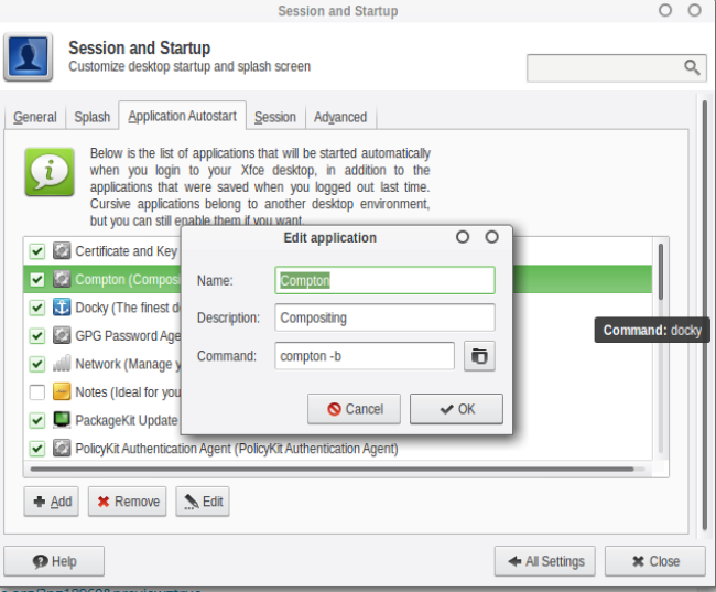
Then go to your settings manager, and choose the Sessions and Startup section. Once you’re in, choose the Application Autostart tab, and add the following process:
…after that, go back to the settings manager and click on the Window Manager Tweaks section. Choose the tab Compositor and untick the Enable compositing display option. Then log out and log back in. First thing you’ll notice are the fancy effects :).
2. Green up you Geeko-Mouse!
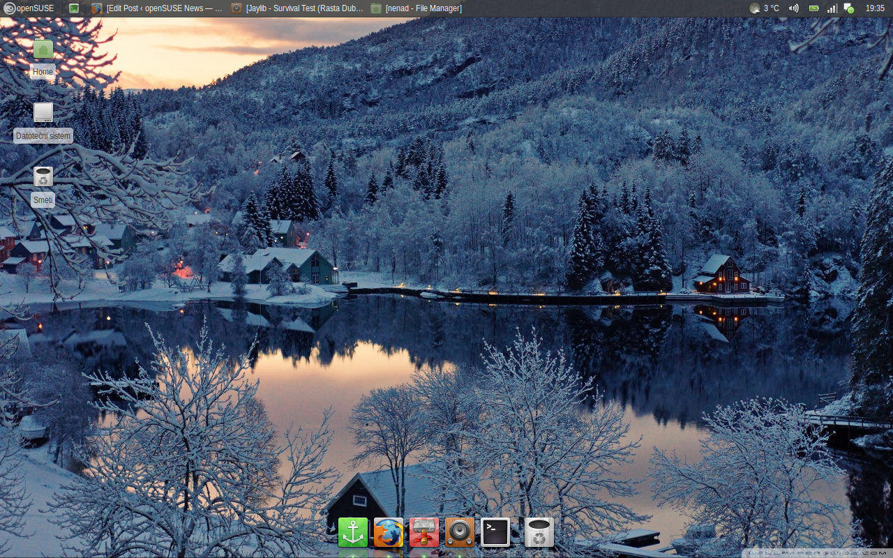
Install the Faenza-mint icon set from here. It’s a set of very comprehensive icons, with a green folder set. Choose it in the Settings Manager > Appearance > Icons section. Next, you can use this super-duper Vertex GTK Theme, in my opinion, the best looking GTK Theme I’ve encountered thus far. It also contains the Xfwm and panel themes. If you’d like a green version of it, to fit your geeko mintiness, you can download my Vertex Green Mod here.
Here’s how it looks:
3. Move your panel to the top
To move your panel to the top, right click on your panel. Choose the Panel preferences under the section panel. Untick the lock panel option and grab the panel with you mouse by the side. Move the panel up. Lock the panel again, and it should work.
4. Make the tray volume icon use pulseaudio
If you’re like me, you’d really like to have the ability to turn the volume to more than 100% on an occasion or two. To do that, install pulseaudio and pavucontrol in YaST. After that, press_ alt + F2_ and run xfce4-settings-editor. There, under the section xfce4-panel, locate plugin-6. It should be set to the “mixer” value. Now, in the command section of the mixer property, change the value to pavucontrol. This will make the volume icon use PulseAudio Volume control when you run the audio mixer from the tray, allowing you to turn the volume up to more than 100% if you’re listening to a very badly recorded sound track.
5. Install docky
Install this beautiful, versatile and responsive dock, which you can use as your tray for launching apps. It supports multiple themes, as well as auto and smart hiding. It seems to be working nice, without any hiccups. So, this might be a good looking option for you to reduce the click numbers for launching your favorite apps.
Conclusion…
While Xfce did start out as a project aiming at weaker/older machines, it evolved into much more than that. It’s stable, fast, versatile and predictable. And, more importantly,** available and fully supported** in your favorite distribution, openSUSE! We urge you to try it if you haven’t already, you definitely won’t be disappointed and we’re certain that the mouse and geeko combination will make you…


